Research
Sep 8, 2025
Beyond the Market Cap: Measuring Token Fundamentals with Ratios Across Narratives
In traditional finance, valuations are often evaluated through standardized and universally accepted metrics such as the Price-to-Earnings (P/E) ratio, Price-to-Sales (P/S) ratio, or Earnings Before Interest, Taxes, Depreciation, and Amortization (EBITDA), which are applicable across entire industries. However, these types of valuation metrics do not appear applicable for crypto projects because they are specifically applied to equity, whereas companies in crypto are mostly, and in our opinion incorrectly, valued by their token.
Often, the most relevant metrics to assess a project in crypto are a project's liquidity, trading volume, and fees. Thus, in this research we analyse different projects in the space using a tailored approach that merges that of traditional finance with some of crypto’s most-relevant metrics.
The findings reveal some interesting takeaways, where some projects show remarkable strength and efficiency, whilst others lack behind which appears to indicate that their valuations are driven by factors beyond tangible fundamentals (shock). Let’s dive in by first understanding the methodology employed in this research.
Methodology
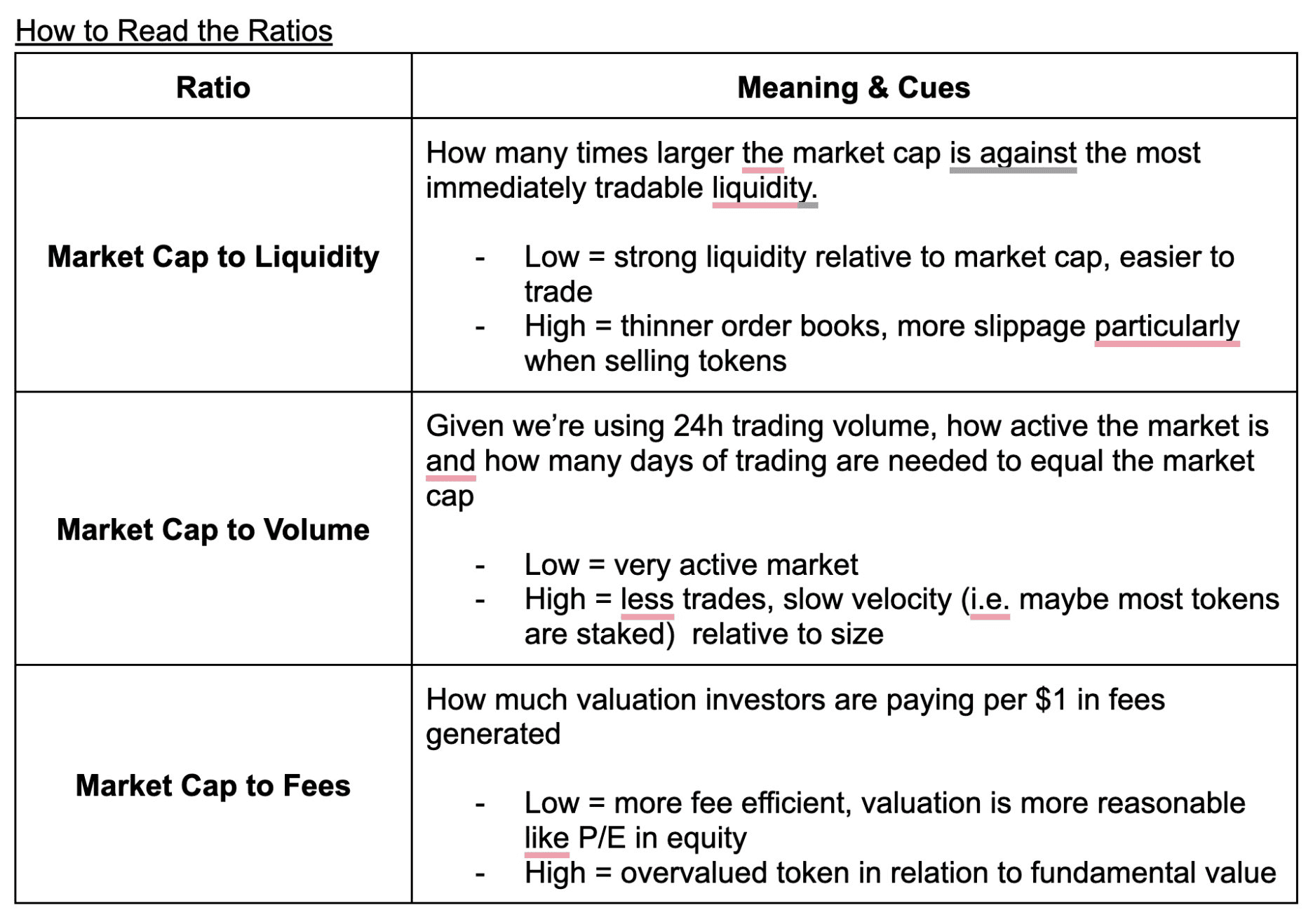
Our analysis consists of using ratios inspired by well known financial metrics such as price-to-earnings ratio (P/E ratio), but tailored to evaluate crypto projects in a more objective manner. For this reason, we created three core ratios: market cap to liquidity, volume, and fees, to provide a comprehensive base to analyze and compare projects across different narratives including L1s, L2s, DEXs, RWA, Stablecoins, DeFi, AI and DePIN.
For all of the metrics included in the ratios, we kept the approach consistent so comparisons were fair.
First, for the market cap to liquidity ratio, we captured the data for the most relevant accessible liquidity at the time of data collection, which consisted of the sum of +2% and -2% depth from CoinGecko, looking only at the top 10 exchanges for each token. All of this data was captured simultaneously, alongside the market cap and 24h trading volume.
Secondly, for volume, we considered 24h trading volume for the ratios, which was also extracted from CoinGecko for all the tokens.
Finally, the Fees are based on 7-day earnings for each protocol. For this we mainly used Token Terminal, grouped by market sector and ranked by 30-day fees, but we only included projects that actually have tokens. For example, Base shows up as one of the top L2s by fees, but since it doesn’t have a native token, it was excluded from the research. We also focused on projects that rank among the top by market cap (around $1B+), which is why the chosen L2s were Arbitrum, Optimism, and Immutable.
While the Market Cap to Liquidity, Volume, and Fees ratios in this analysis provide an idea of an asset's tradability at a given moment, their relevance can be better understood when compared against each other within this specific dataset, rather than against standardised financial ratios and metrics.
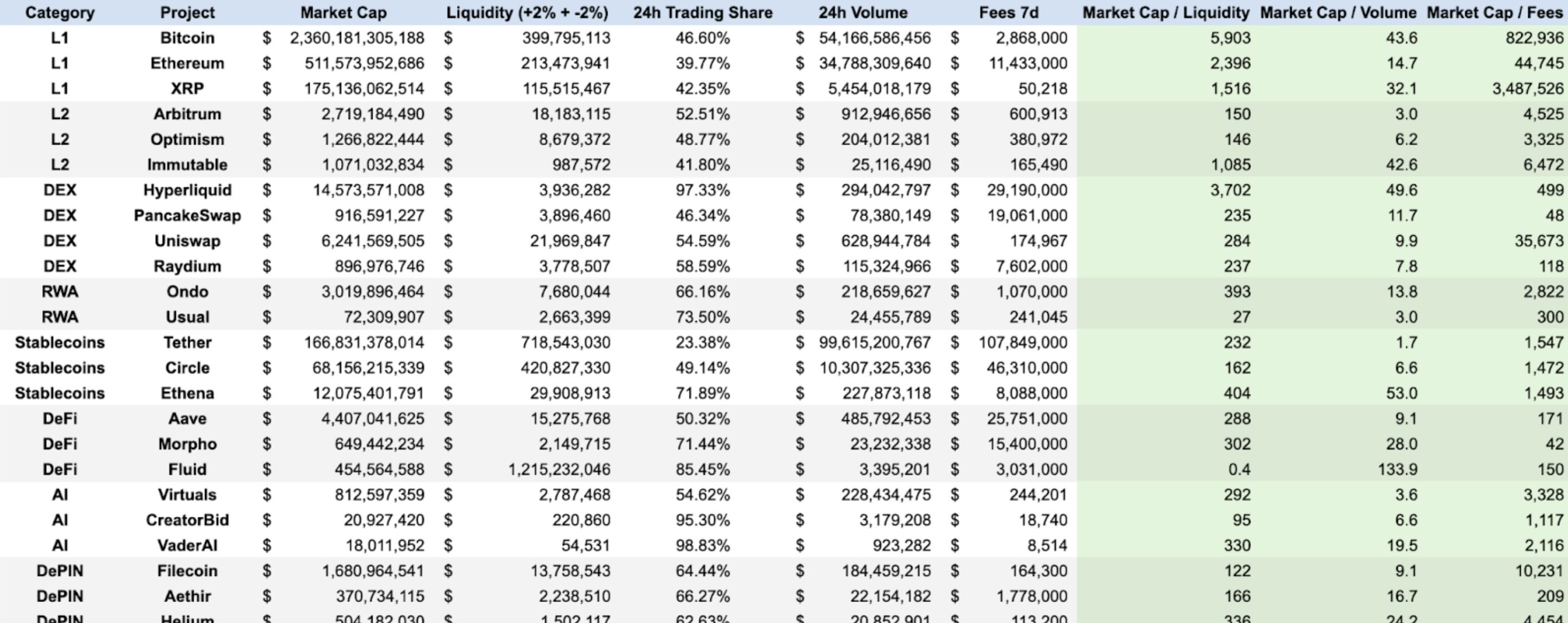
After establishing the methodology and ratios, we proceeded with the data collection process. The following table presents all the raw data collected for this analysis, including market capitalisation, liquidity, 24h volume, and 7-day fees for each project. This data was then used to calculate the three key ratios: Market Cap/Liquidity, Market Cap/Volume, and Market Cap/Fees.
With the methodology and data established, we proceeded by analysing each narrative, starting with the Layer 1s (L1s), which contain the projects with the highest valuations in the market.
In the table below you can appreciate a column called “24h Trading Share”, which basically represents how much of the token’s 24h trading happens on those top 10 exchanges; a higher percentage means the majority of trading activity is concentrated on those exchanges.
L1s
Liquidity
With Bitcoin’s market capitalisation sitting at $2.3T, its liquidity ratio is 5,903, far higher than ETH’s (2,396) and XRP (1,516). Bitcoin’s ratio is absurdly high compared to the rest of the dataset, and this could most likely be because a significant share of its supply is locked up: around 20% is estimated to be lost forever, with a large portion being held by long-term treasuries and institutions such as MicroStrategy and BlackRock. In essence, BTC functions more like digital gold, with most of its supply sitting idle rather than in exchange order books, which is reflected in its Market Cap to Liquidity ratio as there isn’t much need for relatively deep books considering its slow velocity.
On the other hand, Ethereum’s liquidity ratio, while still lower than BTC’s, still indicates low liquidity relative to its market cap. This reflects how ETH is used less as a medium of exchange and more as the network’s security token thanks to staking or being deployed in DeFi protocols.
By contrast, XRP has the lowest ratio out of the three L1s, which may be due to it being positioned more as a payments token, with both retail and institutional usage supported by its speed and low fees. This use case as a medium of exchange may be why there’s likely a larger portion of supply on exchanges, translating into relatively deeper liquidity to its market cap.
2. Volume
Bitcoin also leads in market cap to volume with a ratio of ~44, while Ethereum sits at ~15. However, in this case XRP’s ratio is higher than Ethereum’s at 32.1 which may indicate that while XRP may sustain day to day settlement and payments, ETH is still far more actively traded. This could simply be because of Ethereum’s popularity and being a base asset in DeFi activity, making it more transacted (we would assume primarily due to gas fees) relative to its size than both XRP and BTC. BTC also shows the highest ratio in this case, further highlighting its role as a store of value.
3. Fees
Regarding fees, Ethereum dominates and shows better fee to market cap efficiency. This means that ETH has stronger revenue fundamentals, while XRP’s ratio of 3.48M shows that investors are paying ~$3.5M of market cap for every $1 in fees generated, whereas in Ethereum investors only have to pay $44,745 of market cap.
This highlights how much more productive Ethereum is as a network. It consistently generates revenue from multiple sources such as users paying transaction fees across DeFi, stablecoin transfers, and smart contract interactions. Bitcoin is far behind, but XRP’s ratio is the highest out of the three which makes sense given its design that emphasizes minimal fees to enable fast, low-cost cross border transactions and settlement, rather than capturing secondary revenue like Ethereum is able to.
L2s
Liquidity
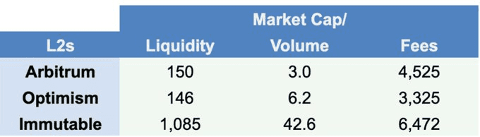
ARB and OP are the most tradable which aligns with the fact that these are the L2s with the highest market capitalization alongside Mantle which was not included in the comparison due to lack of data about their earnings. ARB and OP’s almost-identical market cap to liquidity ratios suggest that these projects’ order books at the ±2% level from the mid price are large relative to their market cap since their valuations are only around 150 times bigger than the available liquidity at this level. These two tokens having similar market cap to liquidity ratios highlight them being the sector’s leaders, albeit Arbitrum has a 116% larger valuation.
Meanwhile, Immutable’s market cap was 1,085 times larger than their order book ±2% from the mid-price at the time of writing. This ratio is around 7 times higher than the other two L2s’, and it could be simply due to it being a less widely-adopted L2 and it operating within a specific niche of gaming.
2. Volume
Looking at the market cap to volume ratio, both ARB and OP lead once again with ratios under 10. This means that their market caps are matched by only a few days of trading activity, highlighting active markets. Nevertheless, Arbitrum shines with the lowest ratio that goes to show that its token is by far the most traded of the three L2s, mainly due to having a much larger ecosystem of dApps, locked value, and community engagement.
On the other hand, Immutable shows a higher ratio which indicates less trading activity tied to having a smaller user base that caters to a niche market, gaming.
3. Fees
On fees, Arbitrum and Optimism are a bit better than Immutable, though the difference is not as marked in this ratio. Optimism shows a slight edge over Arbitrum, which is likely supported by a more efficient architectural design that uses a single-round fraud proof system that assumes transactions are valid by default.
What is more evident here is that Immutable is once again, the weakest of the three, which reflects how operating in a niche like gaming attracts fewer users and generates less fee revenue than the broad DeFi and stablecoin activity that drives usage on Arbitrum and Optimism.
DEXs
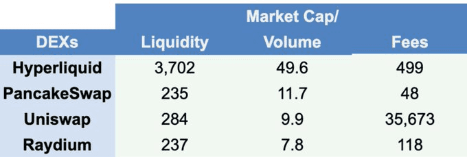
Liquidity
On liquidity, PancakeSwap, Uniswap, and Raydium stand out with the lowest ratios, meaning their order books are relatively deep compared to their market caps and traders can move size without major slippage. Hyperliquid is the outlier in this case with a much higher ratio, showing that its market cap is far larger than the liquidity backing it. This aligns with how Hyperliquid quickly rose to become the largest DEX ranked by token’s market cap, but the token is likely not traded as much since it’s not designed to be used as a means of payment.
2. Volume
Uniswap has the lowest market cap to volume ratio, suggesting its market cap is matched by just a few days of trading activity. PancakeSwap and Raydium show a more moderate yet still-low ratio, while Hyperliquid lags behind with a high ratio. This is actually insightful because it highlights how PancakeSwap, Uniswap, and Raydium all have tokens that are actively traded by holders whereas Hyperliquid’s token shows slower velocity.
The difference hinges on token utilities: Hyperliquid’s is more than just a DEX token, it works as the token for fees and rewards, but it is also used to secure Hyperliquid’s L1 and powering decentralised governance for an ecosystem that is growing considerably.
3. Fees
When it comes to fee efficiency, PancakeSwap is the clear leader with the lowest ratio, meaning investors are paying far less per dollar of revenue compared to its peers. Uniswap, on the other hand, looks expensive despite dominating liquidity and volume, it trades at a much higher multiple of fees. Raydium sits in the middle, while Hyperliquid shows stronger fee efficiency than Uniswap.
Albeit Hyperliquid has a massive user base and generates a lot of fees, the ratio is still high because of their massive $14B valuation and in another hand, despite the launch of their own L2, Unichain, Uniswap's fee generation remains disproportionately low, indicating that a promising (on paper) product doesn't always translate into substantial revenue.
RWA
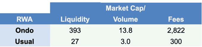
Liquidity
Ondo and Usual both show relatively low market cap to liquidity ratios compared to most categories, meaning their order book depth is strong relative to their valuations. Usual in particular looks exceptionally lean, with liquidity making up a meaningful fraction of its cap, suggesting investors can enter and exit positions with minimal slippage despite its smaller size. Ondo, being larger, still maintains a healthy liquidity profile that supports its role as the leading RWA token.
2. Volume
Regarding trading volume for their tokens, both Ondo and Usual feature low market cap to volume ratios, showing that their daily exchange activity is high relative to their size. For Ondo, this indicates active participation and constant flow through major exchanges, but Usual’s even lower ratio suggests that volume highlighting intense trading interest despite its smaller scale.
3. Fees
In terms of fee efficiency, RWAs also look strong. Ondo’s market cap to fees ratio is in a healthy range, showing investors aren’t overpaying dramatically for current earnings. Usual, thanks to its smaller cap, looks even more efficient, with a fee ratio far lower than many larger projects across categories. Both cases suggest the RWA narrative is not just growing in market value but also supported by real usage and revenue generation.
Stablecoins
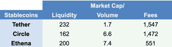
Liquidity
Stablecoins naturally have high liquidity efficiency, with both Tether and Circle posting some of the lowest market cap to liquidity ratios across the entire dataset. This means their order books are extremely deep relative to their market cap, reflecting their role as the backbone not only of crypto trading, but also as assets that power on and off ramping to retail and institutions. Therefore, if stablecoins had no liquidity, no one would be able to swap most tokens that have pairs with these assets.
2. Volume
On trading activity, Tether shows an extremely low market cap to volume ratio, with its full market cap turning over in just a day or two of trading, highlighting its use as the dominant settlement, pair, and payment currency in crypto. Both Circle and Ethena see a slightly higher ratio but still indicate heavy flow relative to its size.
Ethena’s stablecoin, USDe, has more utilities than USDT and USDC since its holders are enabled to stake it to earn yield from Ethereum’s funding rates in derivative markets, which is already more utility than USDT and USDC. This is reflected in the higher market cap to volume ratio which represents slow token velocity because holders are likely also staking the token for extra yield rather than using it only for payments, as they would do with USDT and USDC.
3. Fees
When it comes to fees, stablecoins have relatively some of the lowest market cap to fee ratios in the dataset, showing that they are fee-efficient relative to their valuations. Tether and Circle generate massive revenue from reserve yields and Ethena from staking crypto collateral and profits from delta-neutral derivative hedging.
In this case, Ethena’s market cap to fee ratio is lower than Tether and Circle’s, suggesting that out of these stablecoins, investors pay less dollars of valuation per $1 of fees generated on Ethena’s USDe, which may show both an effective revenue/fee capture system and positive market sentiment for new players.
DeFi
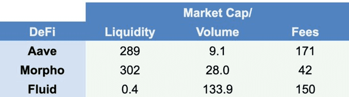
Liquidity
Among the DeFi tokens, both Aave and Morpho have strong liquidity relative to market cap, which means it’s easier to trade. For both of these protocols, liquidity is essential since their native tokens are intricately tied into the architecture at different levels from governance to safety modules
However, Fluid’s incredibly-low ratio of 0.4 is an anomaly since it’s basically suggesting that the depth at the 2% level from the mid price is higher than its market cap. By looking at the initial table with the complete data, Fluid’s Market Cap sits at $454M with liquidity (depth at ±2% on top 10 exchanges) of $1.2B. Notably, this liquidity is also siloed in the top 10 exchanges, as they manage 85.45% of it which is unusual and odd.
2. Volume
Regarding trading activity, AAVE stood out as the strongest with a low market cap to volume ratio of 9.1 which shows that it is an active market. Morpho trades less relative to its ratio, and Fluid’s ratio shows a substantial difference.
Both Aave and Morpho have integrated their tokens into core functionalities. AAVE holders can stake the token to power Aave’s security mechanism, which acts as a backstop in case of system failures. Similarly, MORPHO offers enhanced rates for token stakers. While these utilities aim to decrease active token trading (velocity), MORPHO's incentives for holding and staking appear more appealing to users, as it shows less active trading compared to AAVE based on the ratios.
3. Fees
Morpho stands out with a market cap to fee ratio that is considerably lower than Aave’s, suggesting that investors can pay less for each dollar that the protocol generates in revenue. Aave is still strong and is among the lowest ratios in the dataset, but it trades at a relatively more expensive valuation than Morpho while Fluid’s ratio is surprisingly lower than Aave’s.
The reason why Morpho may be showing better fee efficiency is its architectural design and features, such as a P2P matching engine with high gas efficiency and DeFi vaults that can achieve a capital efficiency of up to 90% compared to Aave’s 60-80%, which act as the protocol’s main differentiators.
AI
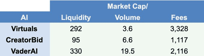
Liquidity
Among the AI tokens, CreatorBid has the lowest market cap to liquidity ratio, showing it has the deepest order book support relative to its size. Virtuals sits higher, and VaderAI even slightly higher, meaning their valuations are much larger multiples of liquidity at the analyzed point and they are thinner to trade in and out of compared to CreatorBid.
Nonetheless, these 3 projects have relatively low market cap to liquidity ratios which aligns with both their product offerings and token utilities because their native tokens are fundamental for each of these AI ecosystems.
2. Volume
On 24h trading activity, Virtuals shows the lowest market cap to volume ratio, suggesting strong turnover and active flow relative to its size. CreatorBid trades less actively, with a slightly higher ratio, while VaderAI screens as the least active of the three as its market cap is supported by far less daily trading. However, all of them have relatively some of the lowest ratios seen in the dataset.
As hinted above, product offering and token utilities are well aligned within these projects. The tokens are vital for AI agent creation, fair launches and participating in the AI agent economy. There are two angles to explain the low token velocity. From one side, it could mean the token is mainly being staked and not transacted as much, and on the other hand, it could mean that the project is not as active given that the token should have a greater turnover if users were actively using the tokens to intervene with AI agents launched on these platforms.
3. Fees
The AI category is not the most fee efficient in this analysis, with all three projects showing high market cap to fees ratios. This means valuations might be priced more based on narrative and expected growth than on current protocol earnings, which aligns with how the high activity on these AI protocols ceased shortly after their massive popularity in early 2025. Virtuals, CreatorBid, and VaderAI all sit in a range where investors are paying higher value of market cap relative to the fees being generated.
DePIN
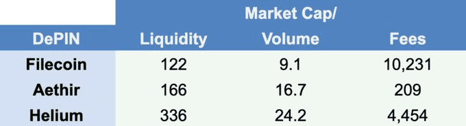
Liquidity
Filecoin has the strongest liquidity profile among DePIN tokens at the analyzed level, with the lowest market cap to liquidity ratio in the group. This suggests that their order books are relatively lower relative to its size, which makes it easier to trade compared to Aethir and Helium. Aethir sits in the middle with a slightly higher ratio, while Helium has the highest, meaning its valuation is supported by a slightly thinner order book depth 2% from the mid price.
2. Volume
On trading activity, all three DePIN tokens show moderate market cap to volume ratios compared to the rest of the dataset. Filecoin again looks healthiest with a lower ratio, suggesting a higher trading flow relative to its size, while Aethir and Helium are less active, with higher ratios that suggest slower trading flow compared to their valuations.
Filecoin’s lowest ratio may be due to the usage of the FIL token to incentivize miners to provide storage space and validate data in the network. As a long-standing and renowned project in the industry, this ratio indicates that tokens are not as actively traded in the market, but held.
3. Fees
Lastly, regarding fee efficiency, DePIN tokens were overall weaker than other categories. Filecoin, despite being the sector leader, still shows a relatively high market cap to fees ratio, meaning its valuation is far above what it earns in protocol revenues. Helium follows the same pattern, with a lower ratio, while Aethir stands out and positions itself as one of the lowest market cap to fee ratios from the dataset which stems from the fact that it has the strongest revenue model of the three projects, with the ability to sell GPU compute to enterprise and developer clients which arguably has a larger addressable market than only decentralized cloud storage or decentralised wireless network.
Conclusion
To sum it up, this brief analysis using only some of each category’s leaders helped us identify general trends, strengths and weaknesses about each category. In first hand, L1s are very split in each ratio, with Ethereum boasting a much lower market cap to fees ratio than Bitcoin’s, and XRP showing a massive valuation compared to their captured fees. However, XRP showed the lowest market cap to liquidity ratio, indicating that it has the strongest liquidity relative to market cap in this category.
L2 tokens generally stand out as some of the most actively traded and liquid categories thanks to Arbitrum and Optimism showing strength in these aspects relative to their valuations. Tether and Circle stand out mainly thanks to volume and fee capture with ratios that indicate fee efficiency and high trading activity even with their sizable valuations.
DeFi showed Aave as the liquidity and volume leader while Morpho led in market cap to fee capture, though interestingly, Fluid stood out as well. DEXs are split apart, with Uniswap leading on liquidity and PancakeSwap on fee efficiency. DePIN projects like Filecoin, Aethir, and Helium show relatively high market cap to fees ratios, and lastly, AI tokens showed fee ratios that are competitive enough with some of the most acclaimed categories such as stablecoins.
Overall, this analysis showed that token valuations in crypto can be tied to liquidity, volume, and fees to uncover more about a project’s fundamentals than their plain market cap or fully diluted values. Projects with low liquidity ratios can demonstrate stronger market depth and healthier market conditions, while those with low market cap to volume ratios could point to token designs that encourage staking or long-term holding over active trading.
Furthermore, low market cap to fee ratios highlight more robust and sustainable business models that diversify revenue streams and capture real usage, whereas high ratios might suggest valuations that are inflated by speculation or trends. In conclusion, the robustness of a token economy can often be tied to how well its design will end up aligning with token holder behavior.