
Blog Post

Introducing The New Look Simplicity Group
We rebranded because the market did
The industry has matured from its nascent revolutionary hype to an improved technology for real businesses. From crypto to digital assets. We must grow with it, and a brand built for the earlier version of the market was never going to fit the one replacing it.
Our clientele have also elevated, from crypto projects to publicly traded companies, from founders that are playing around with code to those with millions in revenue looking to grow in digital assets. Thus, the brand should read the same way: serious, analytical, fast, and direct. They have no time for noise, and need an operative with sharp instincts who can execute. Whilst that has always been Simplicity, we felt our branding has passed its prime.
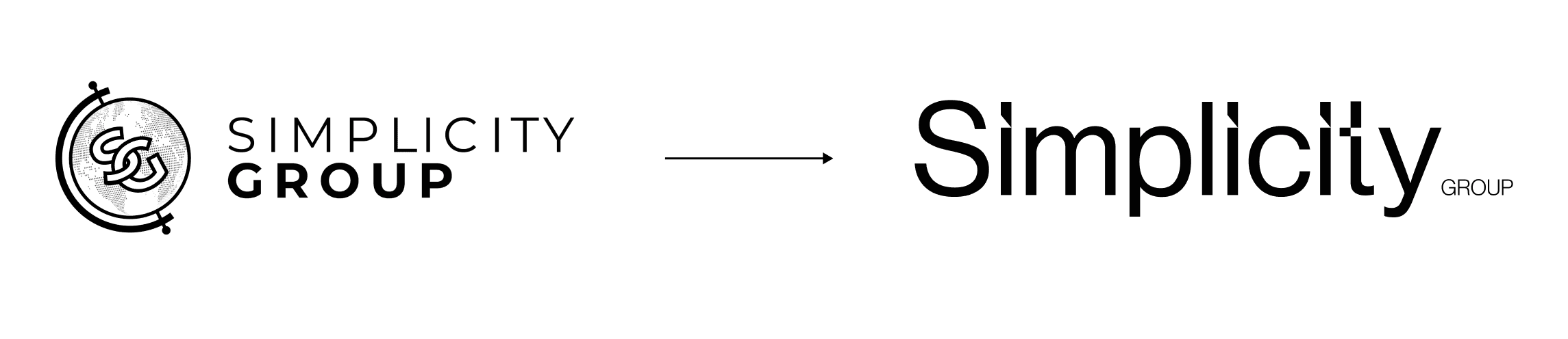
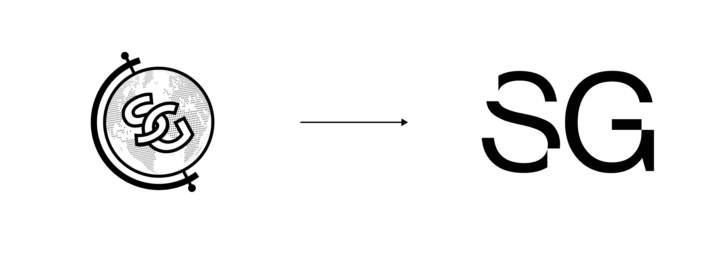
The calibre of our company has scaled over the years and the gravitas of the name Simplicity warrants it standing alone, so we decided to let the icon step back and have the wordmark lead.
We are global
The Simplicity Group globe that has become synonymous around the world for the best tokenomics, research, and advisory services, and stood for our goal to become a global company.
We do not need the mark to argue that now. Our network spans every continent, and our work has reached more than half of the countries on the planet. We believe our efforts make the case on their own, so the logo can focus on what truly matters - Simplicity.
We are letting the trusted globe rest, having helped us achieve everything we needed and more.
Institutional typography
We also acknowledged that simplicity can often come across as basic or facile, especially when it’s applied to every written output. Hence, Montserrat gave way to Neue Haas Grotesk, a clean, contemporary sans-serif expression that reflects precision, confidence, and modern restraint.

Illustrations
The palette is mostly white and near-black, with two greens used as accents, representing our bullish views on the industry and belief in the companies we work with.
Our illustrations also have not been designed without thought.
The glass reflects our dedication to transparency, whilst the fluid motion symbolises our adaptation to each clients needs and, simultaneously, our commitment to attuning to the constantly shifting industry, keeping our clients at the absolute forefront of any latest developments.

A new era
None of this changes who we are or what we do. Same people, same thesis, but with a sharper expression. The identity now communicates not only simplicity, but the confident expertise that facilitates it.
This rebrand is a testament to our evolution as a company, from a London tokenomics shop to an international digital asset consultancy, and that, at least in our eyes, is exactly where we want to be.
The rebrand was completed by LKI Consulting (lkiconsulting.com), a marketing and growth agency, helping us reposition our branding to keep what we stand for but suited for a new market and its participants. Without them this wouldn’t have been possible. Highly recommended for anyone looking to elevate their brand and target bigger tickets.
Category
Company Updates
Author
Simplicity Group
Read Time
Company Updates
Brief
Simplicity Group has rebranded for a maturing market, here's more info on the rebrand.
Copy Link
Copied!
Share with founders, operators, and teams building in crypto.


